Charts Page
The Charts Page of the Reports Module displays a table of all charts that have been created by or shared with an individual.
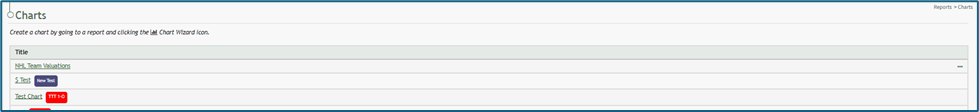
If an individual created the chart, the three dot icon opening the chart table context menu will be visible. If a chart was shared with an individual, the three dot icon accessing the context menu will not be visible. The Chart Table Context Menu displays options to view, edit, or delete a chart.
Chart Table Context Menu Explanations | ||
Option | Comments | Image |
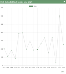
View Chart | Selecting “View Chart” from the context menu opens a Chart Modal that shows the selected chart. |
|
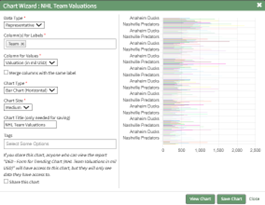
Edit Chart | Selecting “Edit Chart” from the context menu opens the Chart Wizard Modal, allowing an individual to make changes to the chart properties while viewing a preview of the chart. |
|
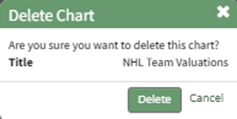
Delete Chart | Selecting “Delete Chart” from the context menu opens the Delete Chart Confirmation Modal. |
|
Charts are created based on the data from a specific report. To create a chart, select the chart wizard icon on a report page or from the Reports Module Home Page.
How To: Create a Chart
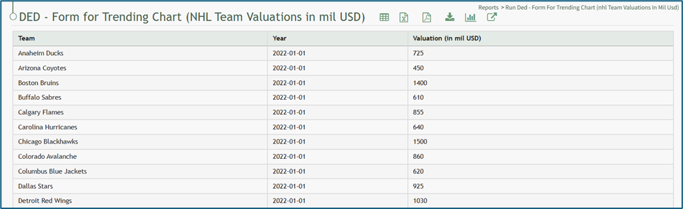
To create a chart, go to the Home Page of the Reports Module and open the report you wish to use for the necessary chart data.
How To: Run a Report
To run a report, go to the Home Page of the Reports Module.
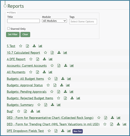
Click the name of the report you wish to run.

Select the chart icon to the right of the report title header. This opens the Report Module Chart Wizard Modal.
The chart icon for a specific report is also accessible on the Home Page of the Reports Module.

Chart Wizard Modal Explanation | ||
Input | Comments | |
Data Type (required) | Representative | Trending* |
Chart Type (required)
Options are based on the data type. | Bar Chart (Vertical) | Line Chart |
Bar Chart (Horizontal) | ||
Pie Chart | ||
Line Chart | ||
Doughnut Chart | ||
Column for Labels (required) | For representative data, any field can be selected as your independent axis. | *For trending data, the label (independent axis) should be a value representing the date. |
Column for Values (required) | The dependent axis must be linked with a column that contains numeric values for a chart to be made. | |
Merge Columns with the same label Checkbox | When the merge columns with the same label checkbox is selected, the numeric values input will be added together and the total shown on the chart as opposed to individual values. | |
Chart Size (required) | Options: Small, Medium, Large, X-Large, Max | |
Tags | Select open, restrictive, or permissive tags as desired. | |
Share this chart Checkbox | If you share this chart, anyone who can view the report will have access to the chart, but they will only see data they have access to. | |
View Chart | Selecting the View Chart button will expand the Chart Wizard Modal and show a preview of the chart being generated. | |
After specifying the appropriate inputs for the chart, select “View Chart” to see a preview of the representation of the data. If no additional changes are needed, select “Save Chart”. A confirmation modal states, “The chart has been saved.”

The new chart is now visible on the Charts Page of the Reports Module.