Understanding Fields: Form, Formatting, and Utility Field Explanations
Fields are the individual data elements that makeup forms. You can think of them as a container for a type of information. They are the building blocks the Forms Module uses to collect, store, and process data in a structured way.
Every field has properties (or metadata) that define it: a Name/Identifier (what the field is called internally), the Data Type (what kind of data it can hold), Constraints (the rules that limit what data is valid), Default Value (what to use if no data is entered), and Validation Rules (checks to ensure the input meets expectations, e.g., email format, numeric range).
In KAStrack, individuals with Admin permissions can define custom fields that appear as form inputs that can be utilized in structured formats. There are three field types utilized in the Forms Module: form fields, formatting fields, and utility fields. Users can also reference data from a database in a field.
A form typically contains multiple fields to match the data collection requirements. Using fields effectively, allows the form to be highly customized.
One of the advantages of using KAStrack Forms to collect and store data is the integration of the Reports module, allowing custom reports that can be used to analyze and trend the information collected.
Form Fields
A form field is an individual input element within a digital form that allows a user to enter, select, or submit data. Each form field captures a specific piece of information after the form (or modal) is submitted.
The table below shows the type of form fields (that indicate the type of data/information to be input) utilized in the Forms Module and the customizable choices associated with them.
Form Field Type Choice Explanations | |||
Form Field Type | Customizable Choices | Comments | |
Text | Start Hidden | If selected, the field will be hidden when the modal first loads. | |
Show in View / Manage Entries | Selected by default; Deselect if the field is being used for data acquisition and you do not want it to be visible. | ||
Must Be Unique | If selected, the system will force the entered value for this field to be unique from any previously submitted entries. | ||
Force Capitalization | Selecting “Force Capitalization” will convert inputted text to all capital letters. | ||
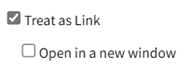
Treat As Link |
| When selected, the input becomes a clickable link. A checkbox selection forces the link to open in a new tab. | |
Text Box | Start Hidden | If selected, the field will be hidden when the modal first loads. | |
Show in View / Manage Entries | Selected by default; Deselect if the field is being used for data acquisition and you do not want it to be visible. | ||
Must Be Unique | If selected, the system will force the entered value for this field to be unique from any previously submitted entries. | ||
Force Capitalization | Selecting “Force Capitalization” requires the information input to be capitalized. | ||
HTML Text Box | Start Hidden | If selected, the field will be hidden when the modal first loads. | |
Show in View / Manage Entries | Selected by default; Deselect if the field is being used for data acquisition and you do not want it to be visible. | ||
Must Be Unique | If selected, the system will force the entered value for this field to be unique from any previously submitted entries. | ||
Checkbox | Start Hidden | If selected, the field will be hidden when the modal first loads. | |
Show in View / Manage Entries | Selected by default; Deselect if the field is being used for data acquisition and you do not want it to be visible. | ||
Checked By Default | If selected, the checkbox field created will be selected by default. | ||
Dropdown | Start Hidden | If selected, the field will be hidden when the modal first loads. | |
Show in View / Manage Entries | Selected by default; Deselect if the field is being used for data acquisition and you do not want it to be visible. | ||
Must Be Unique | If selected, the system will force the entered value for this field to be unique from any previously submitted entries. | ||
Add Blank |
Select the plus sign icon to add additional entries. Textboxes must be saved individually through the disc icon or by the clickable “Save All” link. | ||
Add "Other" Option | If selected, “Other” will be included as a checkbox that when selected, opens a textbox for data input. | ||
Multiple | If selected, allows a user to pick more than one item from the dropdown menu. | ||
Options |
Select the plus sign icon to add additional entries. Textboxes must be saved individually through the disc icon or by the clickable “Save All” link. | ||
Radios | Start Hidden | If selected, the field will be hidden when the modal first loads. | |
Show in View / Manage Entries | Selected by default; Deselect if the field is being used for data acquisition and you do not want it to be visible. | ||
Must Be Unique | If selected, the system will force the entered value for this field to be unique from any previously submitted entries. | ||
Options |
Select the plus sign icon to add additional entries. Textboxes must be saved individually through the disc icon or by the clickable “Save All” link. | ||
Date | Start Hidden | If selected, the field will be hidden when the modal first loads. | |
Show in View / Manage Entries | Selected by default; Deselect if the field is being used for data acquisition and you do not want it to be visible. | ||
Must Be Unique | |||
Date / Time | Start Hidden | If selected, the field will be hidden when the modal first loads. | |
Show in View / Manage Entries | Selected by default; Deselect if the field is being used for data acquisition and you do not want it to be visible. | ||
Must Be Unique | If selected, the system will force the entered value for this field to be unique from any previously submitted entries. | ||
File Upload | Start Hidden | If selected, the field will be hidden when the modal first loads. | |
Show in View / Manage Entries | Selected by default; Deselect if the field is being used for data acquisition and you do not want it to be visible. | ||
Max File Size | If left blank, the maximum upload file size is 500 MB. | ||
Allowed Extensions | Any extension | Allow anything to be uploaded. | |
Images | .jpg, .jpeg, .png, .gif, .bmp, .svg | ||
Documents | .doc, .docx, .odt, .pdf | ||
MS Word Document | .doc, .docx | ||
Spreadsheets | .xls, .xlsx, .csv | ||
MS Excel Spreadsheet | .xls, .xlsx | ||
MS Powerpoint Presentation | .ppt, .pptx | ||
Custom | Allows the form creator to specify what can be uploaded | ||
Allow Multiple Files | If selected, multiple files can be uploaded. | ||
Mandatory | If selected, a file upload will be required. | ||
Image | Start Hidden | If selected, the field will be hidden when the modal first loads. | |
Show in View / Manage Entries | Selected by default; Deselect if the field is being used for data acquisition and you do not want it to be visible. | ||
Include Image Thumbnails When Viewing the PDF of an Entry | If selected, images will be included in a separate page when viewing the PDF of an entry. The modal will expand, allowing for the customization of the max width and the max height of the thumbnail. A checkbox allows you to space images evenly on the separate page. | ||
Max File Size | If left blank, the maximum upload file size is 500 MB. | ||
Allow Multiple Files | If selected, multiple images can be uploaded. | ||
Mandatory | If selected, an image will be required. | ||
Password | Start Hidden | If selected, the field will be hidden when the modal first loads. | |
Show in View / Manage Entries | Selected by default; Deselect if the field is being used for data acquisition and you do not want it to be visible. | ||
Signature Field | Start Hidden | If selected, the field will be hidden when the modal first loads. | |
Must Be Unique | If selected, the system will force the entered value for this field to be unique from any previously submitted entries. | ||
2FA Authorization | 2FA stands for two factor authorization. If selected, KAStrack will require a second method of authorization. | ||
Image Map Picker | Start Hidden | If selected, the field will be hidden when the modal first loads. | |
Show in View / Manage Entries | Selected by default; Deselect if the field is being used for data acquisition and you do not want it to be visible. | ||
Must Be Unique | If selected, the system will force the entered value for this field to be unique from any previously submitted entries. | ||
Multiple | If selected, allows a user to pick more than one item from the dropdown menu. | ||
Image for image map | Choose an image to upload - this is the image that will show on the Form, within which defined regions of the image will become selectable choices. | ||
Image Map HTML | Code that defines selectable regions on the image. There are a number of free websites that can be used to generate the image map HTML. Some examples are https://www.image-map.net/ and https://www.maschek.hu/imagemap/. | ||
Highlight Sections | When Hovering | Handles the selectable image region's appearance when the user's mouse is hovering over that region. | |
When Selected | Handles the selectable image region's appearance when the user has clicked and selected a region, or chosen that region from a dropdown. | ||
Selections Display Style | Show selections as text | Lists selected image regions as plain text below or above the image. | |
Show and allow selections in a dropdown | Provides a dropdown field where selected image regions will show, but also allows the user to pick regions without having to interact with the image directly. | ||
Selections Display Position | Let's you choose where the selections display text / dropdown shows, either above or below the image map. | ||
All field types include a checkbox option to "Include on Form" that is selected by default. | |||



The following information can also be used when creating a form field.
Form Field Creation Inputs | |
Field | Explanation |
Default | Whatever is input as the default will automatically be input into the form entry. The default can be replaced by the individual adding the entry. |
Placeholder Text | The Placeholder Text textbox can be used to display greyed out text in a textbox that can be used as a hint in the field. It can be a maximum of 25 characters and will disappear when information is entered. |
Context Sensitive Help | Context Sensitive Help will be visible when the blue question mark icon is clicked. Utilize this to include additional information needed to aid in completion of the field. |
Field Validation | Field validation is the process of checking that the data entered into a form field meets specific rules or criteria before it is accepted or saved and is used to prevent typos, formatting errors, and missing information from entering the database. The Validation dropdown menu allows a user to select between Optional and Mandatory validation with specific formatting requirements, or a Custom Regular Expression. Selecting Mandatory from the dropdown menu requires that there is content in the field and that it fits a specific format. |
Validation Help | Validation help (similar to context sensitive help) allows for a customized message to explain what/how something needs to be entered for field validation. |
CSS is a standardized system used to determine how web pages look. CSS classes are groupings of various styles (e.g. border, font color and size), and can be defined in KAStrack forms with whatever styles you like. When you assign a CSS Class to a form field, the field inherits all the styling associated with that class. | |
Formatting Fields
A formatting field refers to a field or placeholder in a form, database, or document template. Formatting fields apply style, structure, or output rules to data, controlling how data is displayed, structured, and presented rather than what the data actually is. When a formatting field is used in a database, it is defining the visual output.
Withing KAStrack’s Forms Module, there are four formatting fields: Start Section, End Section, Tabs Start, Tabs End.
Formatting Fields Explanations | |
Field | Explanation |
Section Start | The Section Start formatting field is a control used in a database to signal the beginning of a new logical or visual section. It groups related fields on the same page and adds structure. |
If the start hidden checkbox is selected, the section formatting will be hidden when the field first loads. Note: If you select the start hidden checkbox, you will not be able to use a display CSS style for a section. | |
If the Make Selection Collapsable checkbox is checked, the modal expands with options for character to show when collapsed, characted to show when expanded, additional spacing, if it should start collapsed, and if the section styles should be applied to the section header. | |
Formatting options for the new section include: border, border radius, padding, margin, background color, background image URL, background image position, background image size, background image repeat, font, text color, and rotation. | |
Clicking “Show/hide advanced” opens a CSS Styling textbox. Note: All CSS styles must be valid CSS Styles. | |
All Section Start Fields must have a corresponding Section End Field. | |
Section End | The Section End Formatting Field marks the end of a formatted section that started with a Section Start formatting field. It communicates to the system “Stop applying the formatting or logic that began at the Section Start.” |
All Section End Fields must be used with a corresponding Section Start Field. | |
Tab Start | A tab start formatting field indicates the beginning of a new tab container or page in a multi-section form or document. Tab start creates separate pages or panels within a single form and improves navigation and organization. When you add a tab start field, it creates a new tab header and defines where the content of that tab begins. When another tab start field is used, a new tab is created by the system. |
All Tab Start Fields must have a corresponding Tab End field. Between the two, you are required to have a section that contains fields. | |
Tab End | A Tab End formatting field indicates the end of the active tab container that began with a Tab Start formatting field. |
All Tab Start Fields must have a corresponding Tab End field. Between the two, you are required to have a section that contains fields. | |
Utility Fields
A utility field is a system-level field that performs a technical or aesthetic function such as spacing, visibility control, conditional logic, calculations, or layout consistency in the background. Think of it as a helper field that manages how information looks or functions.
Utility Field Explanations Table | |||
Field Type | Meaning / Purpose | How It Works | Field Creation Notes |
Information | Displays non-editable text, notes, or instructions to guide the user | Does not store data; it’s purely for communication or context within a form | Add descriptive text or HTML formatting |
Not linked to a database column | |||
Excluded from exports | |||
Can include hyperlinks or help icons | |||
Calculated | Automatically computes a value based on formulas or other field inputs | Performs calculations dynamically when the form loads or data changes | Define a formula |
Ensure source field exist and have proper data types | |||
Set decimal precision or rounding rules | |||
Can be updates automatically or when saved | |||
Sequential Number | Generates a unique, automatically incrementing number | Each new record triggers a sequence increment. If the form entry requires approval, the number is assigned upon approval. | Define state number and increment step |
Option to include prefixes (e.g. INV-01) | |||
Ensures prevention of duplicates | |||
Read-only to users | |||
Hidden Field | Stores data that is not visible to the user but is used by the system or workflows | Data may be filled automatically by logic, user ID, timestamp, or lookup. | Hidden from the user interface |
Used for internal references | |||
Ensures security | |||
Read Only | Displays data that the user can see but not change | Pulls values from the database or calculated results but locks editing | Mark as non-editable |
Useful for summary or verification data | |||
Can still be exported | |||
Mail Merge | Acts as a placeholder in document templates that pulls live data into generated files | Replaces tags with actual field values during document generation | Must match database field names |
Verify formatting (dates, currency, capitalization) | |||
Used in templates for Word, PDF, or HTML | |||
Ensures privacy when merging client data | |||
Copy Previous Entry | Automatically fills a field with the value entered in the previous record | When creating a new record, the system retrieves the last entered value for that field | Choose which fields allow copying |
Ensure users can overwrite if needed | |||
Often used for reoccurring data | |||
Improves speed and data consistency | |||
Attach DB/ Form Entry(s) Field | Allows entries from other databases/forms to be embedded into another form | Only saved entries can be attached. | If a form utilizes "save draft and assign" rule or "save draft and run" rule, you are not able to attach the entry that was started. |
If an attached entry is edited, the changes will be reflected in the attachments. | |||