The Dashboard
- Default Dashboard Summary
- Dashboard Context Menu Explanations
- Overview of Widgets
- Module Summary Widget Explanation
- Chart Wizard Explanation
Default Dashboard Summary
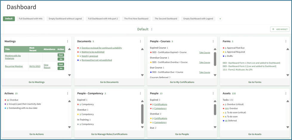
The default dashboard displays eight Widgets: People, Assets, Documents, Forms, Actions, People-Competency, People-Courses, and Meetings. Each widget is a summary of relevant information from that specific module. The placement of these module summaries can be customized by dragging and dropping widgets into your individual preference.
In order to unpin widgets from the default dashboard, KAStrack requires you to create a new dashboard first.
Dashboard Context Menu Explanations
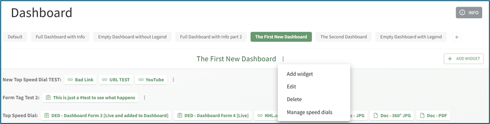
To the right of a dashboard title is a vertical three dot menu that opens a context menu with options to Add Widget, Edit, Delete, Manage Speed Dials.
| Dashboard Context Menu Explanations | ||
| Option |
Explanation | Image |
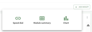
| Add Widget | Selecting “Add Widget” from the dashboard context menu opens the Add Widget Modal on the right-hand side of the screen and has the same function as selecting the “Add Widget” button on the screen’s right side (or in the center of an empty Dashboard). |
|
| Edit |
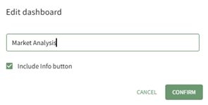
Selecting “Edit” from the dashboard context menu opens the Edit Dashboard Modal, allowing an individual to alter the dashboard name. |
|
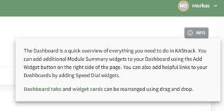
| Deselecting the “Include Info button” checkbox will remove the grey “INFO” button from the top right-hand corner of the dashboard. |
|
|
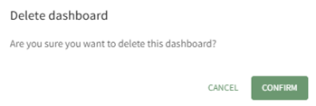
| Delete |
Selecting “Delete” from the dashboard context menu will open the Delete Dashboard Modal. You can only delete the Default Dashboard after creation of a new Dashboard. If all Dashboards are deleted, KAStrack will automatically regenerate a new Default Dashboard. |
|
| Manage Speed Dials | Selecting “Manage Speed Dials” from the dashboard context menu will open the Manage Speed Dial Modal. From this modal, an individual can create, edit and delete speed dials. |
|

Overview of Widgets
The Dashboard is comprised of speed dials and widgets. Speed dials allow you to establish links to KAStrack Documents, Forms, and even URLs, so that you can easily access desired webpages (including webpages outside of the KAStrack system). Widgets highlight module summaries or charts representing report information.
A detailed explanation of speed dials, module summary widgets and chart widgets is provided in the tables below.
| Speed Dial Explanation Table |
||
|
||
| Placement Options |
Explanation | Images of Placement Location |
| Disabled | When placement is marked as disabled, the speed dials will no longer show on the dashboard. Disabled unpins the speed dial from the dashboard without deleting record of it from the Module. | |
| Top |
|
 |
| Floating |
|
 |
| Widget |
|
|

Module Summary Widget Explanation
| Module Summary Widget Explanation Table | |||
On a mobile device accessing the web version of KAStrack, additional options will show in the context menu, allowing the user to rearrange the ordering of the widgets within the widget grid. |
|||
| Module | Comments |
Image | |
| Actions |
Module Summary Widget Key |
|
|
|
|
Overdue | ||
|
|
Nearing due date |
||
|
|
Group(s) past inactivity date |
||
|
|
Outstanding with no due date | ||
|
|
Outstanding |
||
| Assets |
Module Summary Widget Key |
|
|
|
|
Overdue critical item task |
||
|
|
Overdue task | ||
|
|
Critical item task due soon | ||
|
|
Task due soon | ||
|
|
Deferred Task | ||
| Dispatch |
Module Summary Widget Key |
|
|
|
|
To go to scheduled status |
||
|
To go to ready to dispatch status |
|||
|
To go to dispatched status |
|||
|
To go to completed status |
|||
|
To go to cancelled status |
|||
|
To go to archived status |
|||
|
Documents |
Module Summary Widget Key |
|
|
|
|
Overdue continued suitability review | ||
| Waiting to be published | |||
|
|
Need(s) approval | ||
|
|
Require(s) acknowledgement/approval | ||
| Reviewed but not yet approved | |||
| Notification(s) of new revisions | |||
| Drafts Form Entries Assigned to Me | Forms can be designed to allow users to save their current work as a draft, giving them the option to come back to an entry and complete it at a later time. If a user has any active Draft Entries assigned to their account, they can be accessed through a quick link in the Draft Form Entries Assigned to Me Module Summary. |
|
|
| Finances |
Module Summary Widget Key |
|
|
|
|
Outstanding Budget Items | ||
|
|
Pending Approvals | ||
| Forms | Module Summary Widget Key |
|
|
|
|
Approval past due | ||
|
|
Approval required | ||
|
|
Drafts | ||
|
At the bottom of the Forms Module Summary Widget, forms attached to the dashboard are shown as quick links for ease of access. This is set in the Form’s settings by its creator or an Admin.
How To: Add Forms to the Forms Module Summary WidgetTo add a specific form so that it is displayed on specific user's the Forms Module Summary dashboard widget, go to the Form you want included on the Home Page of the Forms Module. Select the three-dot icon opening the Forms context menu.
Select “Edit Form” opening the Edit Form Modal and go to the Advanced Settings section. Input the users or certification roles you wish to see the selected form in their Dashboard Forms Module Summary Widget.
Select “Save” and the form will now be visible on the dashboard to the selected users.
|
|||
| Kanban |
|
All To Do Notifications in Kanban |
Kanban Module Summary
Customizable Kanban Board Module Summary |
| The Kanban Module Summary cannot be customized. Each board will show with the total number of to dos associated with it. |
|||
|
Each Kanban Board can have their own individual Module Summary, which can be customized at the Kanban level. Changes to the Board Module Summary will show to all who add the widget. Coming Soon: How To Customize a Kanban Board Module Summary Widget |
|||
| Meetings |
Meeting with Recent Instance |
|
|
| Meeting with no Instances | |||
| People |
Module Summary Widget Key |
|
|
|
|
Expired Certification | ||
|
|
Expired Competency | ||
|
|
Overdue Certification | ||
|
|
Overdue Competency | ||
|
|
Due Certification | ||
|
|
In Training or Deferred Certification | ||
|
|
In Training or Deferred Competency | ||
| People- Competency |
Module Summary Widget Key |
|
|
|
|
Expired Competency | ||
|
|
Overdue Competency | ||
|
|
In Training or Deferred Competency | ||
| People- Courses |
Module Summary Widget Key |
|
|
|
|
Expired | ||
|
|
Overdue Courses | ||
|
|
Due Courses | ||
|
|
Deferred Courses | ||


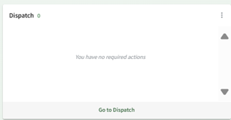

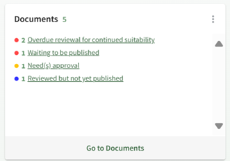


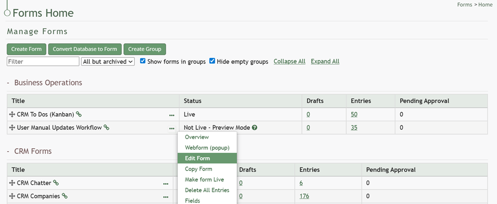


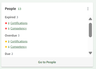


Chart Wizard Explanation
| Chart Widget Explanation Table |
||
|
The widget header in bold identifies the chart title and the chart type. The vertical three dot icon to the right opens a context menu with the options to View Chart and Unpin. |
||
| Charts | Type and Recommended Usage | Image |
| Representative |
Bar Chart: Recommended when comparing quantities across different categories |
|
|
Horizontal Bar Chart: Recommended when comparing quantities across different quantities |
|
|
|
Pie Chart: Recommended when showing composition and parts of a whole |
|
|
|
Line Chart: Recommended when showing continuous data trends over time |
|
|
|
Doughnut Chart: Recommended when showing parts of a whole and highlighting a total or key metric in the center |
|
|
| Trending |
Line Chart: Recommended when emphasizing patterns and direction of change |
|
| Empty Chart |
If you see a chart but no data appears, confirm that the value column contains numeric values. |
|
|
If a chart widget does not show a chart, it is because you do not have authorization to view that data. |
|
|


